You don’t need a perfectly matching collection of napkins, flowers, ribbons and signage to make a celebration look cohesive. In fact, when every surface is exactly the same shade, an event can start to feel more like a product display than a place where people are meant to relax.
A good color palette is less about matching and more about creating a feeling. It gives the details a shared direction while leaving room for texture, contrast and a little personality.
Our team was decorating celebrations before PSO Events was formed, and one lesson has stayed with us: the same colors look entirely different in a real room than they do on a phone. We pay attention to the existing materials, the natural light and the feeling the host wants. The palette should bring those things together, not compete with them.
Begin with the space you’re using
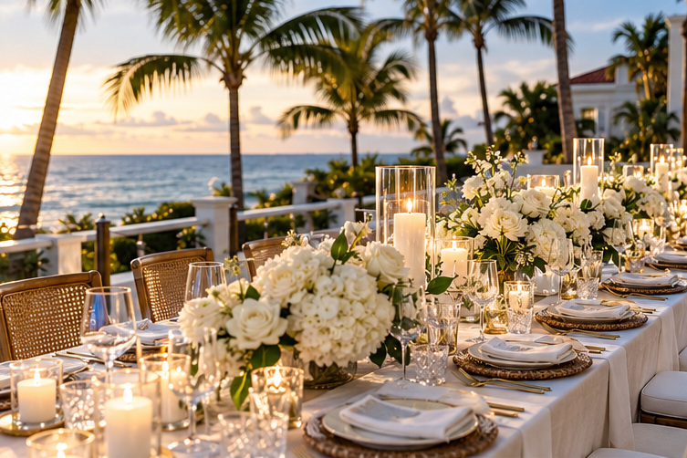
A Palm Beach terrace overlooking the water offers a different starting point from a lush Delray Beach garden or a modern dining room in Boca Raton. Look at the colors that won’t change: flooring, furniture, walls, greenery and the surrounding landscape.
The goal isn’t to copy those colors. It’s to choose tones that look comfortable alongside them. Soft blues and sand shades can be lovely in a coastal space, but coral or citrus accents might provide the contrast that makes the setting memorable. A room with darker wood and warm lighting may call for something richer.
Take a photograph of the space in natural light if you can. It is easier to make palette decisions when you’re looking at the actual venue instead of imagining it from memory.
Pick a lead color, then let the others support it
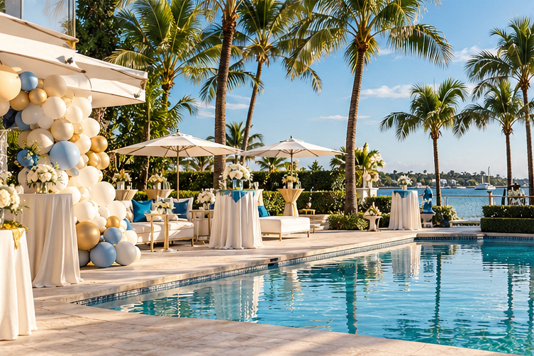
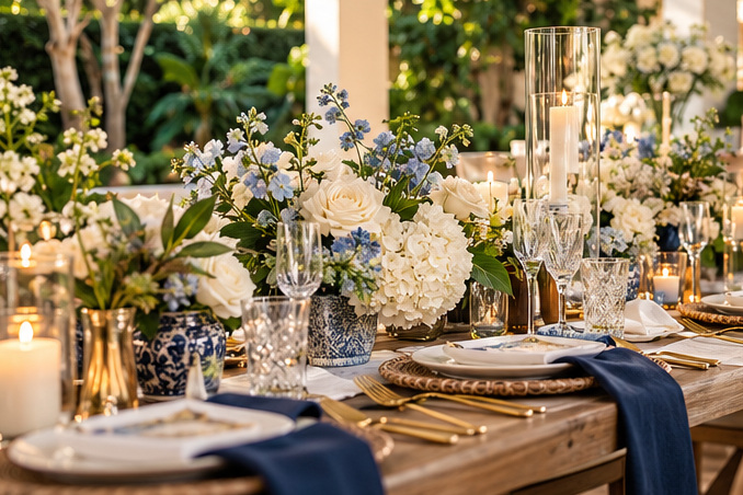
Here’s a simple place to start: one main color, one supporting color and a small accent. That might be navy with cream and a touch of brass, or sage with blush and warm wood. The proportions don’t need to be mathematical, but the main shade should feel clearly dominant.
Avoid giving every color equal attention. If flowers, linens, napkins, signage and favors are all competing for the spotlight, the result can feel busy. Let one element be expressive and keep the others quieter.
It’s also worth asking what matters most to you. If flowers are the centerpiece of the design, build the palette around their natural tones. If you’re working with a statement fabric, let that guide the paper goods. If personalized gifts are important, choose a color that makes the artwork easy to read and the item useful afterward.
Texture is where the design starts to feel expensive
Imagine two tables set in cream. One uses a smooth polyester linen, glossy white plates and identical glass vases. The other has a textured linen, woven chargers, subtle gold flatware and flowers in slightly varied vessels. The colors are similar, but the atmosphere is completely different.
That’s why materials deserve as much attention as paint chips. A little variation in fabric, glass, wood and metal can create depth without introducing more colors. For a South Florida event, natural textures often sit beautifully beside palms, water and garden greenery.
You can also create contrast with scale. A large arrangement might be balanced by very simple place settings, while a minimal table can support colorful napkins or a statement menu.
Check how colors behave in real light
This is one of the most common ways a good plan goes sideways. A blush fabric can look pale in strong daylight and much warmer under indoor lighting. Navy may read almost black in an evening photograph. Metallic finishes can reflect colors you didn’t expect.
Before ordering everything, look at physical samples if possible. View them together in the type of light your event will have. If you’re using custom printing, remember that a screen preview may not perfectly match the finished material.
During setup, we like to step back and look at the whole space rather than adjusting one centerpiece endlessly. If the flowers, linens and signs all look attractive close up but don’t belong together from the doorway, something needs simplifying. Sometimes the fix is removing an accent color rather than adding another one.
Ask vendors for actual material swatches or production proofs rather than relying entirely on digital mood boards. It’s especially helpful when you’re combining flowers, paper products and textiles from different suppliers.
Carry the palette across the moments that matter
Not every item needs to match, but the key moments should feel connected: arrival, dining and any focal display. A small accent in the welcome signage can return in the napkins, flowers or packaging for favors. That repetition gives the celebration a visual rhythm.
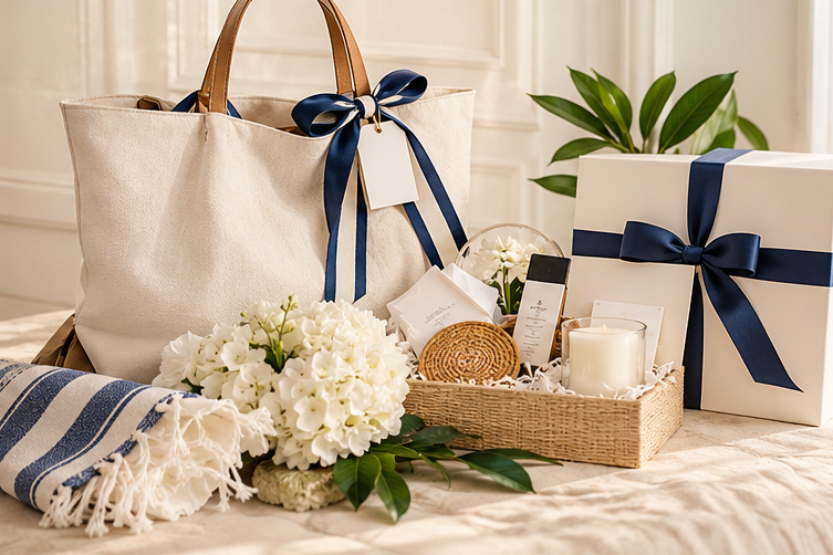
If you’re including custom signage or personalized gifts, bring the palette into those decisions early. A cream tote with navy lettering, for example, may fit beautifully with a coastal tablescape. A different event might call for a bold accent that makes a playful design pop.
It’s okay to let functional items break the palette. Guest comfort and readability matter more than color consistency. You shouldn’t choose a low-contrast sign just because the lettering technically matches the napkins.
Keep the palette flexible for real-world changes
Flowers are seasonal. Rentals go out of stock. Printed materials can look different on different finishes. A good palette gives you acceptable alternatives instead of requiring one exact shade across everything.
Document the direction with a short reference sheet: photos of materials, a few color notes, and examples of what fits or doesn’t fit. Share it with the vendors who need it, but don’t bury them in fifty nearly identical reference images.
Three questions worth asking before committing
Does this feel right for the occasion? An elegant dinner and a poolside birthday might share colors but need different energy.
Can guests read and use everything comfortably? Contrast, texture and practical placement still matter.
Would I like the overall look if one decorative item disappeared? If a theme falls apart without a single centerpiece, it may need a stronger foundation.
A lovely celebration palette should support the experience, not become the experience. When the colors, materials and personal details feel connected, guests notice that everything looks beautiful without necessarily knowing why. If you’d like help shaping that direction, PSO Events can talk through the styling options.