A beautifully designed sign can do two very different jobs. It can help guests find their way, and it can quietly set the tone for a celebration. The best ones manage both without demanding too much attention.
You probably don’t remember every sign you’ve seen at an event. You remember the feeling of arriving somewhere that looked considered and made sense. That is what good event signage should contribute, whether it’s welcoming guests to a Delray Beach birthday, guiding a Palm Beach dinner or introducing a celebration in Boca Raton.
Start with the question the sign needs to answer
A welcome sign says, “You’re in the right place.” A seating chart tells guests where to go. A menu explains what’s being served. A directional sign can prevent people from wandering through an unfamiliar property.
Each of these has a different purpose, and that purpose should shape the design. A tiny script font might look graceful in an image, but it’s not useful for directing fifty people toward the right entrance. A large, heavily decorated welcome sign may make sense as a focal point, while a restroom sign should be clear and nearly invisible as a design object.
List the actual decisions guests need to make during the event. Then create signs only where they help. More signage doesn’t always create a more organized experience.
Working on event décor before PSO Events had a name taught us to see signage as part of the guest experience, not a separate design project. It can be stunning on a computer screen and still miss the mark if people can’t read it on arrival. That’s our cue to revisit scale, contrast or placement.
Make the wording sound like the celebration
Formal wording is appropriate for some occasions; friendly wording is better for others. A wedding dinner may call for a classic welcome, while a poolside birthday can be playful. You don’t need to borrow a line from a popular template just because it’s all over social media.
Try reading the sign aloud. Does it sound like something the host would say? If not, simplify it. Often the name, occasion and a short line of welcome are enough.
It’s also worth proofreading every detail independently: names, dates, table numbers, directional arrows and any instructions. With custom items, a typo is more expensive than the few minutes it takes to catch one. Ask someone who hasn’t been staring at the design for days to review the final proof.
Typography isn’t just decoration
Elegant lettering is part of the look, but legibility deserves equal weight. Pair a distinctive heading font with a straightforward body font. Keep enough contrast between the background and text, and check how the design will read from the distance guests will actually stand.
For a large entrance sign, stand several steps away from a printed proof or full-size mockup. For menus, look at the smallest text in normal lighting. If a sign will be used outdoors at night, think about illumination before choosing a dark background with delicate lettering.
You can create sophistication through spacing and hierarchy instead of adding more flourishes. A little empty space around the important information often makes it feel more special.
Match the material to the location
Acrylic, wood, printed board and fabric all have their place. The right choice depends on the environment, size, display method and budget. An indoor welcome sign has different demands from a freestanding piece exposed to wind and occasional rain.
For a beach-inspired South Florida event, natural wood or a soft neutral finish can feel warm. A more formal setting might suit acrylic or a framed presentation. But don’t choose a material based solely on its appearance. Ask about weight, stable mounting, transport, moisture resistance and venue restrictions.
We’re especially careful with outdoor signs in South Florida because a delicate-looking material isn’t always delicate in the way you expect. Acrylic can reflect glare, paper can warp with moisture and a lightweight stand can be a problem in coastal wind. It’s worth checking the actual environment before falling in love with a material from a photograph.
If you’re planning an outdoor installation, coordinate the sign stand and anchors with the provider. A beautiful sign that tips over in a gust is not an elegant finishing touch.
Let signage carry the color story
A sign can connect the entrance to the rest of the event without matching every decorative item exactly. Repeat one color, typeface or motif from the flowers, menus or guest favors. That small bit of consistency creates a sense of intention.
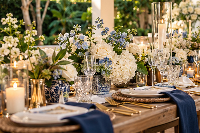
For example, navy lettering and a restrained gold detail can work beautifully with cream textiles. Coral or sage can give a coastal gathering a more playful feel. The goal isn’t to make the sign the loudest object in the room, unless it’s deliberately the main focal point.
If you’re also ordering personalized totes, towels or shirts, consider whether the same small emblem can appear on a guest item. It doesn’t have to be identical everywhere; a family resemblance is enough.
Think about where people will actually see it
Placement is just as important as design. A welcome sign hidden behind a line of arriving guests isn’t helping anyone. A seating chart should be visible before people enter the dining area, with enough space to pause and read. A small directional sign might need to be repeated at a turn in a long walkway.
Walk the space as though you’re visiting for the first time. Look for moments of uncertainty: the driveway, a side entrance, a transition between outdoor areas, the location of the bar or the path to a restroom. These are the places where a clear sign can quietly improve the guest experience.
Keep signs out of narrow walking routes and confirm safe placement with the venue. Beautiful shouldn’t mean inconvenient.
Don’t leave installation until the last minute
Before ordering, determine who delivers the sign, who installs it and who takes it down. A large acrylic piece may require specific transport or protective packaging. Freestanding signs may need hardware that isn’t included with the printing.
Confirm dimensions, mounting instructions and final artwork approvals early. If someone else is coordinating the event, give them a simple location plan with the sign names and where each belongs. A few labeled photographs can be more useful than a long email chain.
Once everything is in place, look at the entire arrival sequence rather than each sign individually. Does the welcome feel clear? Do the colors and wording make sense together? Can someone find what they need without asking for directions?
That’s when signage becomes more than decoration. It gives an event its voice while making guests feel comfortable. If you’re considering a custom signage or styling project for a South Florida celebration, contact PSO Events and tell us about the setting, tone and details you want to bring together.